What to consider when choosing fonts in difficult reading situations including signage, small point sizes or scanning? But also what to look out for when designing for struggling readers. Type Tricks, the third installment in the collection, focuses on usability in typography and how different typefaces and letter shapes influence the way we read. Distilling advanced typographic knowledge into an accessible medium with beautiful illustration, the book acts as a small and handy guide for those looking to impart a certain message from their chosen text.
From beginners looking to learn more about typography to practitioners seeking an advanced level of knowledge without the need to read through extended research articles, Type Tricks will be your go-to book. Each double-page spread focuses on a range of intricate parts of typography, giving examples and illustrating them as to teach users through visual learning. As aesthetic as it is useful, this book is a fantastic gift for a design lover.
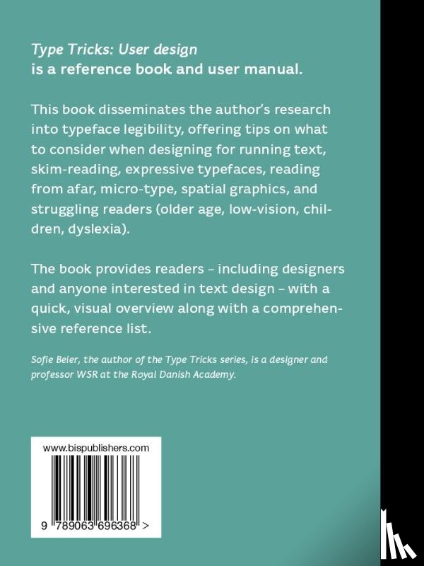
With 140 evidence-based tips that help the user excel in typographic design, this book is a must-have when designing for the modern reader. Type Tricks: User Design is a dissemination of the author’s research into typeface legibility. What to consider when choosing fonts in difficult reading situations including signage, small point sizes, glance-like reading or scanning? But also what to look out for when designing for struggling readers, for example people with low-vision, elderly, children and people with dyslexia.
This kind of research is normally communicated in scientific papers, which takes a long time to read and understand. In this book, all findings are presented in an illustrative and easily accessible way. The book has a small amount of text and lots of illustrations presenting more than 140 tips from evidence-based research.
Ik heb een vraag over het boek:
‘Type Tricks: User Design - Beier, Sofie’.
Vul het onderstaande formulier in.
We zullen zo spoedig mogelijk antwoorden.